Sunday, 23 October 2011

Business Identity, John Steinbeck

I was given a name of a person for whom I had to devise a set of business stationary. The assumed style and presentation should clearly reflect my understanding of that person, and what is unique and special about them. The style of the stationary can be transposed to a contemporary feel.
I would consider business papers such as business cards, compliment slips and letterheads.
My person is John Steinbeck.
John Steinbeck writes social novels about economic problems of rural labour.
I have decided to work around the quote:

'Take notice'

This quote is relevant to how he writes about the hardship of the time and how you have to take notice of the area around you.
I started this project by using the word 'notice' and taking notice of the environment around us.

The project went various ways around the idea of looking trough a hole to notice themes that Steinbeck wrote about.
I designed a letter head, bookmark, business card and a wheel that could be given to students to learn about how themes of his books interlock with each other. The bookmark is designed to highlight certain words on the page of a book, to give a new story.

Design choices such as typeface and punctuation were carefully considered and the choice not to use a capital letter on his name was relevant and he was not a 'bold' man, he was only interested in getting people through the depression using the medium of writing.

below are a few photographs of the final designs 


Tuesday, 18 October 2011

whynotassociates and Gordon Young

Artist Gordon young and the whynotassociates have created a typographical artwork called the comedy carpet.
This I saw in the creative review.. it is absolutely insane. On my foundation in Chelsea we were told. 'follow/ stalk an agency you would like to work for... aim higher than you think'

I have followed the whynotassociates for a few years now and it is their execution of their design projects that is why they are at the top of the game. This comedy carpet is an idea.. jokes on the floor can be interoperated in various ways but as you can see from below the typographic imagery is why this project has got the national news (and the multimillion pound budget).
Congrats whynotassociates.

images from whynotassociates- http://www.whynotassociates.com


These magazines are where the inspiration came from, typography, imagery and colour were all absorbed into the project.


aucb T-shirt/ Hoddie design

There is a competition run by the SU at our uni to design an image to be put on the hoddies/ tshirts. Below are 3 of my designs. My favourite is the Bournemouth university design as so many people assume that student in bournemouth all go to the university rather than the arts college. 
Plus its an on going joke as one of my housemates are from the university.


Wednesday, 12 October 2011

Notice 'business identity'

This design is simplistic. It is designed so make the audience stop and think. Notice.

John Steinbeck wanted and wrote about 'hope'. He wanted people to notice that the times of hardship and depression will change.


John Cage

This video is 4 minuets and 33 seconds of pure silence. It is so the audience can stop and think about what is going on and then begin to reflect. 

This has inspired my design of the 'Business Identity' project.

Business Identity

I was given a name of a person for whom I had to devise a set of business stationary. The assumed style and presentation should clearly reflect my understanding of that person, and what is unique and special about them. The style of the stationary can be transposed to a contemporary feel.
I would consider business papers such as business cards, compliment slips and letterheads.


My person is John Steinbeck.


John Steinbeck writes social novels about economic problems of rural labour.
I have decided to work around the quote:


'Take notice'


This quote is relevant to how he writes about the hardship of the time and how you have to take notice of the area around you.


I started this project by using the word 'notice' and taking notice of the environment around us:


Thursday, 6 October 2011

FDA Visual communication- First project


So for this new course I will put work, inspiration and general interest on this blog. Not only for part of the course, but for me to archive the work throughout the last 2 years.
This first project is a group project and we had to create a series of three posters that share a graphic system/convention, and revolve around one distinct theme.

The content displayed will follow a single theme, but the posters should present 3 'facts' related to it that are:

- common knowledge
-an extraordinary fact
- a statement that is a complete lie.

Our agreed category was 'student loan'- a subject that is very close to us as a class.
We started by finding out how much we pay which is £3375 per year and we worked out that each day we are in class it costs us £47 per day.

I have personally started this project by thinking  that if it costs £47 per day.. If we miss class because we are hungover from drinking then we are wasting £47. Which is crazy.. Seriously makes me think twice about going out with a 9.30 start the next day.

Below is the first initial design and it will be refined when presented to the rest of our group.


The second design is the 'truth'
When submitted to the Crit the humour was understood. The Idea that £5 was wasted in the Club IAVA IGNITE in the form of being sick at the end of the night was acknowledged by the class. As to be fair does usually happen.


Friday, 10 June 2011

Work For IDOL

Below is my design for the from cover of IDOL issue 2. The design is bold, Brave and shows a bit of arrogance. The design team all like it. the text has to be slightly adjusted though.


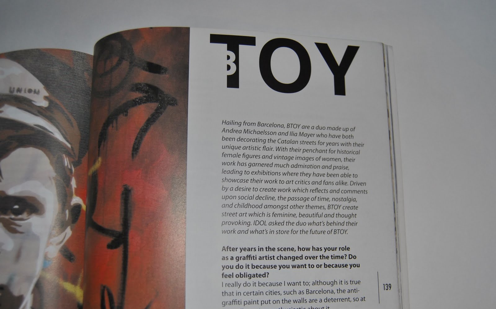
This is a selection work I have done in the First issue of IDOL magazine. Spreads and Illustrations.